A digital evidence ecosystem for an Australian state police force
Body-Worn Cameras • Public Safety · Mobile, Web & Kiosk
Role
Sole UX designer — end-to-end across mobile, web DEMS and device configuration
Timeline
May 2024 – May 2026
Team
Embedded with a 40+ person product & engineering org
Skills
Enterprise UX, Information Architecture, AI-Assisted Workflows, Cross-Platform Design Systems
Covered by an NDA with an Australian state police force. The force, its commands and districts, deployment scale and all commercial figures are withheld, and product and entity names are anonymised. The screens below are shown with invented sample data, and each is paired with a simplified schematic isolating the pattern it demonstrates — no real recording, case, exhibit, device or sworn-officer record appears anywhere on this page.
Overview
I started working on this project in March 2024.
This wasn't a single product. It was a connected system of hardware and software — body-worn cameras, in-car cameras, 4G cameras, a kiosk with a palm-vein scanner, mobile applications, and the web-based evidence platform. These systems had to work across hardware-to-software and hardware-to-hardware integrations, while supporting different roles, permissions, and operational workflows.
Before designing anything, I spent hours going through user guides, technical documentation, role and responsibility documents, existing workflows, and system behaviours to understand how everything connected.

The Challenge
Evidence was arriving faster than anyone could account for it. Hundreds of recordings a day landed in a single undifferentiated list, most of them never needed as evidence — but the ones that mattered were buried in the same feed as routine patrol footage, sorted by nothing more useful than recency.
The people responsible for that record were also, in practice, the fleet manager and the helpdesk. A supervisor had to know what existed, whether it was intact, who touched it, who could see it, what had been disclosed and what had to be destroyed — while also fielding calls about a camera that would not turn on.
The commercial constraint made it harder: this is a product sold on evidentiary defensibility. Anything that made the workflow faster but the record weaker was not a trade the business could take.
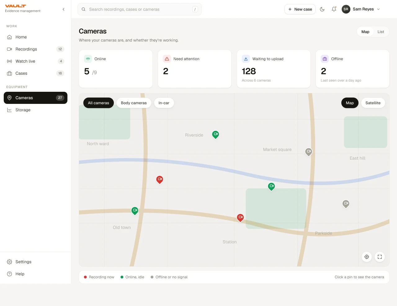
The System
Before designing anything I had to make the system legible to myself. Evidence, cases and device telemetry each lived in their own mental model, and users were expected to reconcile them by hand.
The architecture below is what the product resolves to: an admin console organised around Media, Streaming and Dashboard, and a field app organised around the officer's own work — with Sessions and Cases as the shared spine underneath both.
Research
The assumed pain points and the real ones diverged sharply, which is why the fieldwork was not negotiable. Interviews ran across the full chain — officers, supervisors, investigators, evidence technicians, administrators, device-maintenance staff and judiciary users — because each of them inherits the previous role's shortcuts.
Alongside primary research: support-ticket and product-feedback analysis, device telemetry review, stakeholder workshops with product, engineering and domain experts, and iterative design reviews through implementation.
What I Found
Five findings did most of the work in reshaping the product. None of them were what the team expected going in.
- –Documenting video was harder than capturing it. Officers captured willingly and often — describing footage accurately afterwards was the actual bottleneck, and it happened at the exact moment users had the least recall and the least patience for typing.
- –End-of-day offload meant footage sat on a device for a full shift. That is a window of risk for loss, damage and delay, and it existed purely because the kiosk was the only route off the device.
- –Device faults in the field were handled alone. No one to ask, no obvious next step, and an escalation path that ran through a phone call to the supervisor.
- –Supervisors inherited whatever officers did not do. Every skipped metadata field became somebody else's backlog, which meant the desk experience was largely a consequence of the field experience.
- –There was no shared definition of handled. Two supervisors could review the same file while a third was missed entirely, because status lived in people's heads rather than in the system.
The Design Tensions
The interesting decisions on this product were not usability problems with a correct answer. They were tensions where both sides were legitimate, and the job was to decide which one won in which context — and to be able to say why.
Speed vs. accountability
Efficiency rewards removing steps; evidentiary integrity demands visibility. Resolved by simplifying how people interact with controls rather than removing the controls, and never letting auditability live only in the backend.
Field use vs. desk use
Seconds and split attention against hours and dense information. Resolved by refusing a single average-user experience: same object model, deliberately different posture per surface.
Automation vs. human judgment
AI could remove the documentation load, but the model probably got it right is not acceptable for evidence. Resolved by automating the work around the decision, never the decision.
Hardware dependency vs. mobility
The kiosk guaranteed a controlled chain of custody; the phone was already in the officer's hand. Resolved by making the kiosk optional rather than removing it, wherever the workflow did not genuinely need it.
Simplicity vs. system complexity
Most users were not tech-savvy and used the product briefly, daily, under pressure — but the domain is genuinely complex. Resolved with hierarchy and progressive disclosure, so complexity stayed available but never led.
Design Principles
Nine rules, authored early and applied in order of precedence whenever two of them conflicted. Writing them down was what let me defend a decision to engineering months later without relitigating it from scratch.
Design for the widest end of the spectrum
Critical workflows built around the least confident user without slowing down experienced ones. If someone unfamiliar could not finish a task unaided, that was a design defect, not a training problem.
Trust is a feature
Ownership, status, history and consequential actions stay visible inside the workflow itself, not buried in an audit table someone has to go looking for.
The field and the desk are different worlds
Field: one clear action, minimal reading, immediate feedback. Desk: context, density, filtering, control.
Safety is something the product can influence
Officers depend on this system in unpredictable environments, so a technical failure becomes an operational risk. A lost GPS signal is an alert someone must investigate, not a line in a log.
Remove hardware dependencies that do not add value
The kiosk forced officers back to a station to offload footage — a hardware constraint expressed as a UX problem. Push transfer to the device already in their hand.
Three steps, then it should just work
Setup and recovery usually happen beyond the support team's reach, so recovery is a designed experience: common flows within three clear steps, in user language, before any support dependency.
Let AI do the documentation, keep judgment with the human
AI prepares, organises and surfaces. Consequential decisions stay with the person, and the system never implies more certainty than it has.
Design for the device that exists
More functionality means more battery drain, and a camera that dies mid-shift is a product failure regardless of interface quality. Battery, connectivity and storage were evaluated per feature from the start.
Go to the field before drawing the screen
Assuming was always faster than observing, and always more expensive. What users did in the field consistently outranked what the team assumed in a workshop.
Reframing the Problem
The brief I was handed was make the review interface better. The finding that changed the product was that the review interface was inheriting a problem created two steps upstream — so the highest-leverage change to the desk experience happened outside the desk experience entirely.
If metadata is captured in the field, at or near the moment of recording, the supervisor never inherits the debt for it. That single reframe moved the supervisor's job from authoring metadata to verifying it, and pulled upload forward out of the end-of-shift window at the same time.
Decision 01 · Triage Before Chronology
The old entry point answered what happened. The redesign answers what needs you. Sessions open on work queues — uncategorized, aging, approaching a deadline — instead of a reverse-chronological feed where a flagged incident from Tuesday sits below routine patrol from this morning.
The alternative considered was a smarter sort on the existing list. I rejected it because sorting still requires the supervisor to interpret; a queue with an explicit shared vocabulary answers the question by structure instead.
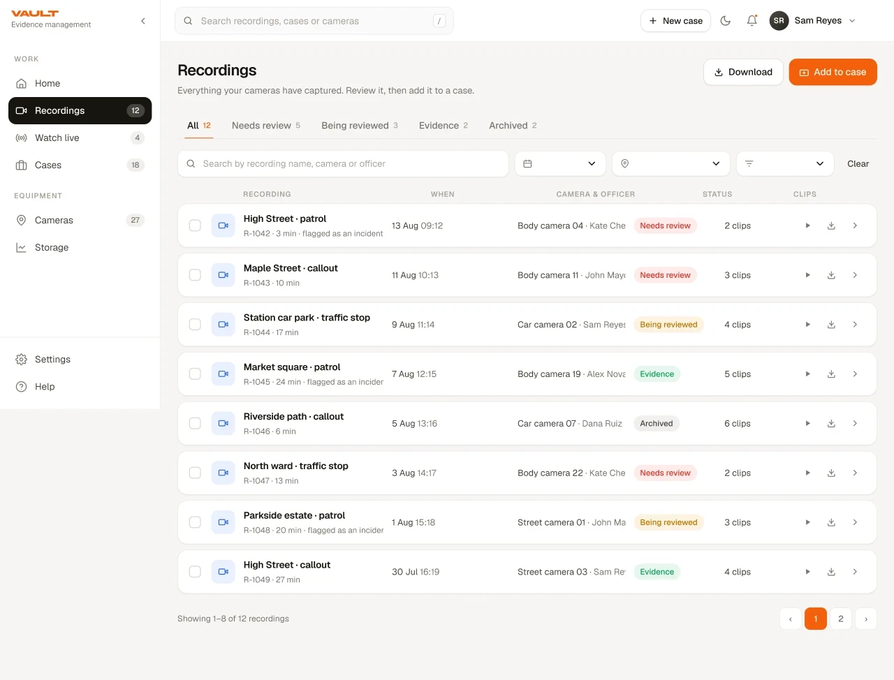
- Status became a fixed vocabularyUncategorized → Categorized → Evidence, mutually exclusive, always in the same column position. Scannable peripherally without reading the label.
- Counts derive from the same query as the listThe number a supervisor acts on and the list they open can never disagree, because there is only one source.
- Selection uses the accent fill, not just a tickThe target of a bulk action is unmissable — bulk operations on evidence are exactly where a wrong selection is expensive.
- Device identity travels with every rowSerial and MAC sit under the session ID, so attribution survives sorting, filtering and export without a drill-in.
Decision 02 · One Detail Pattern, Reused Everywhere
Rather than designing a bespoke screen per object, I built one detail pattern — a horizontal tab bar over a two-column layout, main content beside a related-items rail — and reused it for Sessions and Cases alike.
This is the decision with the most downstream leverage in the whole project. It meant a user who learned the session screen already knew the case screen, and it meant engineering built the shell once.
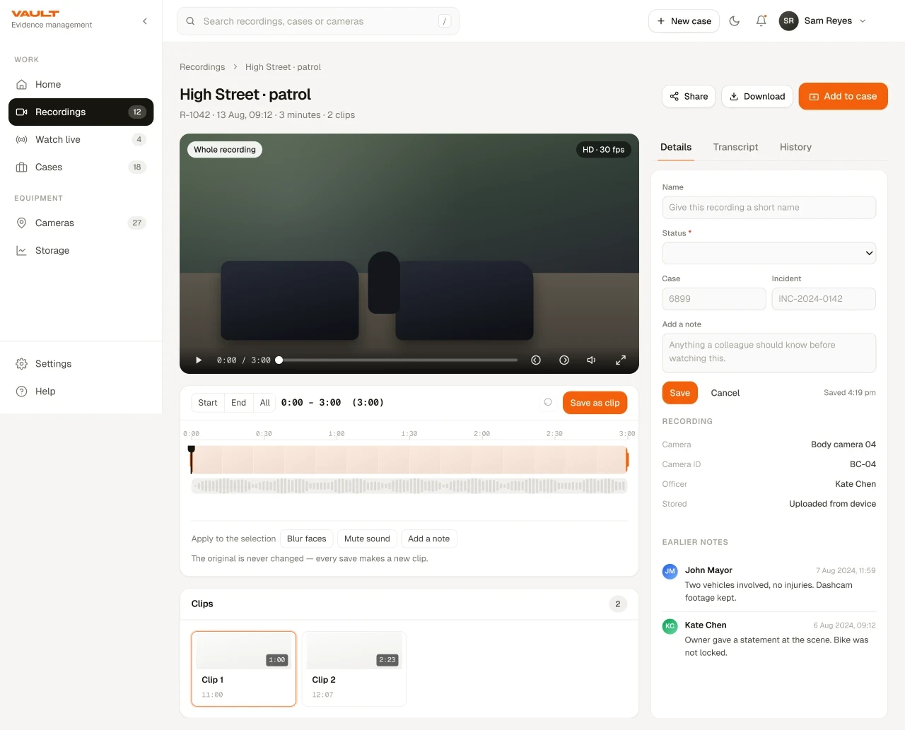
- Four tabs, ordered by frequency of useFile information first because it is the daily job; audit trail last because it is consulted, not edited.
- The rail keeps siblings in reachChild files and adjacent sessions stay visible, so moving between related media never costs a round-trip back to the list.
- Category is the only required fieldMarked inline with the accent border. Everything else can wait; the one field that unblocks the rest of the workflow cannot.
- Identity strip is always above the tabsOwner, status and incident flag persist across every tab, so context never disappears when the user switches task.
Decision 03 · The Original Is Never Modified
The highest-stakes surface in the product, governed by one rule. Redaction, beeping, clipping and annotation all operate on a selection and produce a new derived file — the source is untouched, always.
Derived files are first-class records with their own identifier and a visible link back to the parent, and every save writes an audit entry describing the range and the treatments applied. The destructive path does not exist rather than being discouraged.
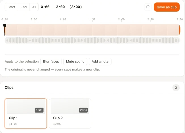
- Treatments are labelled regions on the timelineNot hidden in a settings panel — a reviewer can see what was done at a glance and remove any of it individually.
- The unselected range is dimmed, not croppedThe full recording stays visible while the selection is being made, so the operator never loses the surrounding context.
- Audio waveform sits under the video trackBeep redaction targets speech, so the operator needs to see audio to place a treatment accurately.
- The safety guarantee is stated in the tool beltWritten where the destructive-looking action lives, not in a help page — the moment of hesitation is the moment to answer it.
Decision 04 · Custody Moved Into the Interface
Chain of custody existed in the database but not on screen, which meant answering who touched this required an administrator and a support ticket. Moving it into the primary interface, in plain language, made supervisors self-sufficient on the question the product exists to answer.
Edits, status changes, case additions, exports and shares all append to the same record — including system events like ingest and integrity verification — so one narrative covers the file's whole life rather than three partial ones.
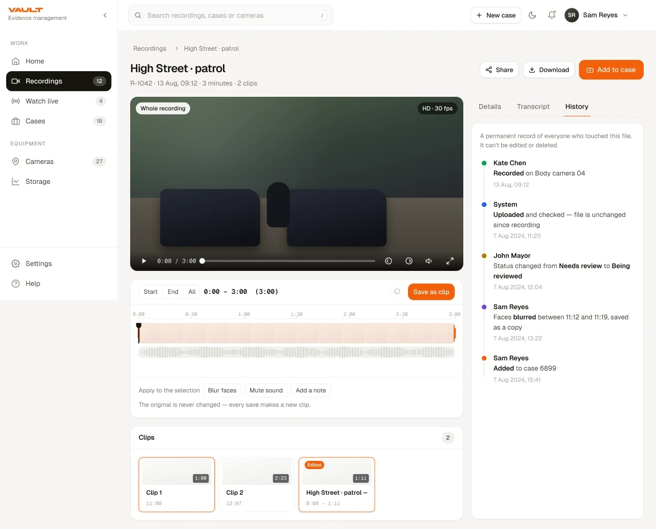
A permanent record of everyone who touched this session. It cannot be edited or deleted.
Decision 05 · Cases as Containers, Not Exports
Sharing outside the organisation used to mean an export and an email attachment, at which point control was gone and there was no record of what left, to whom, or for how long.
Cases became containers that gather sessions, derived clips and attachments into one reviewable unit. Sharing operates on the case with explicit named recipients, access is revocable, and revocation is treated as consequential enough to require confirmation. Every sharing event appends to the same custody record as everything else.
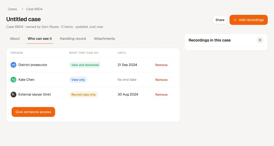
Case description — narrative context linking the attached sessions.
Designing Across the Ecosystem
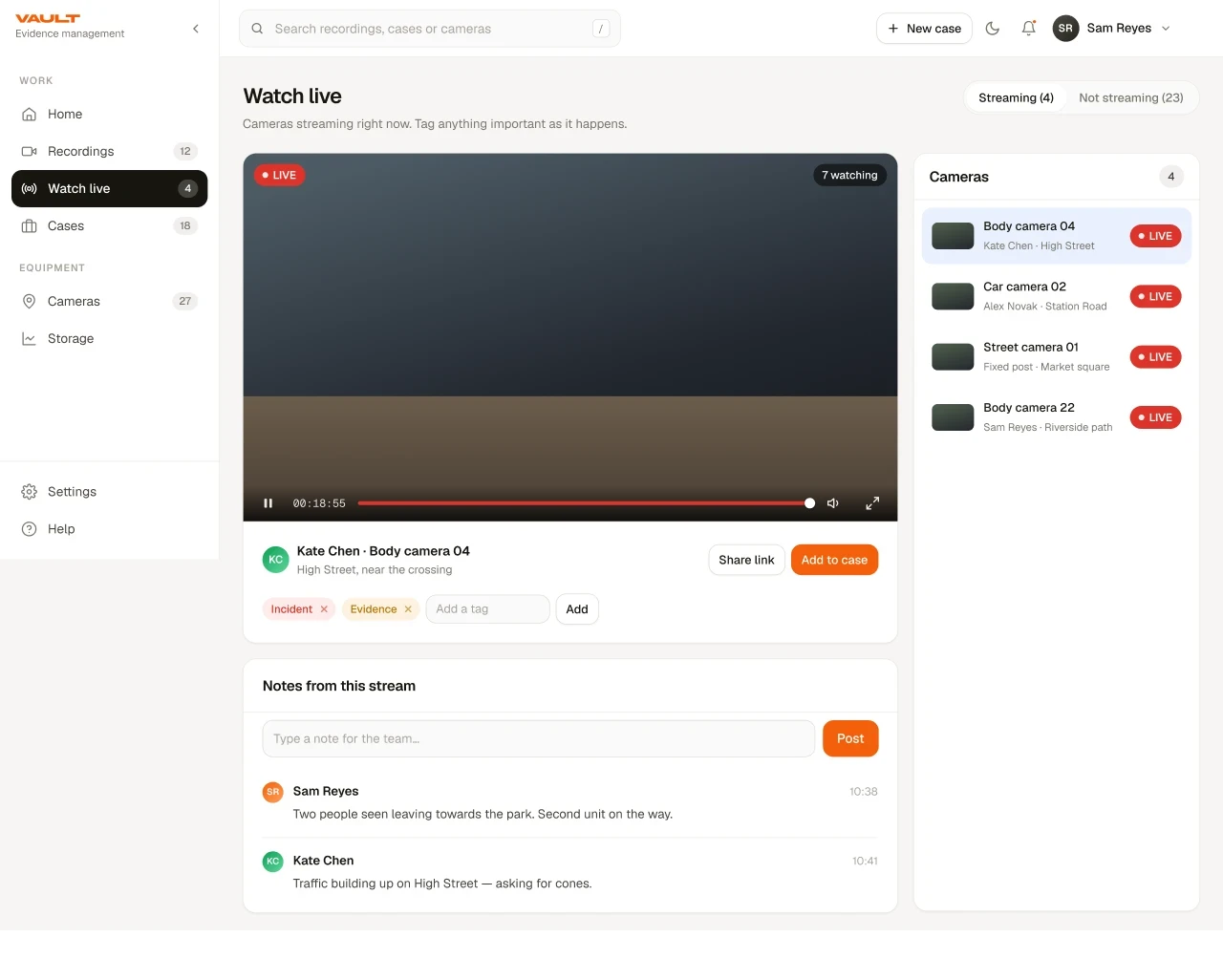
The surfaces are not three versions of the same app. The mobile app exists to close the gap between capture and documentation; the kiosk exists to guarantee a controlled handover; the console exists to make sense of everything after the fact.
What holds them together is the object model, not the layout. A session created on a device, described on a phone, edited on the console and shared into a case is one record moving through four contexts — and the design work was mostly about making each handoff survivable.
AI & Trust
Transcription turned scrub for ten minutes into a query. Transcript lines are navigational — selecting one moves the playhead — so finding the moment a suspect mentions a vehicle stopped meaning real-time scrubbing.
The trust design matters more than the capability. Automated output is framed as assistive, not authoritative: it carries a visible caveat to check against the audio before evidentiary use, it is labelled as auto-generated at the point of reading, and it never enters the record as fact. AI prepares, organises and surfaces; the human decides.
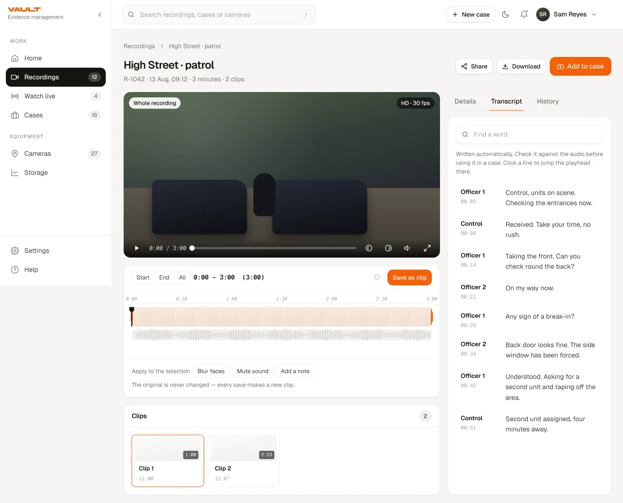
Written automatically. Check it against the audio before using it in a case — selecting a line moves the playhead to that moment.
Can you tell me what happened with the car before we arrived?
It was parked here about an hour, then the driver came back and drove off quickly.
I think the car was a dark blue hatchback, but I could not see the plate.
That is helpful. I am recording this on my body camera.
- The caveat sits above the resultsNot in a tooltip and not in a help page. It is the first thing read, because by the time someone is scanning lines they have already started trusting them.
- Auto-generated is a persistent badgeIt travels with the transcript into export and download, so provenance is not lost the moment the content leaves the screen.
- Speaker diarization without named attributionSpeaker 1 and Speaker 2 rather than guessed identities — the system does not assert something it cannot verify.
- Matches are highlighted, not filtered toSurrounding dialogue stays visible, because a match without context is exactly how a transcript gets misread.
Building the System
With one designer and 40+ engineers, consistency could not depend on me reviewing every screen. It had to be structural: a small set of components that appear everywhere, with their states and interaction specs defined once.
The reused patterns did most of the governance work. The tabbed detail shell, the search and date-range bar, the status chip, the notes-with-history block, the vertical audit timeline and the map component each appear on multiple surfaces with identical behaviour — which is also why a new feature could usually be specified as a composition of existing parts rather than a new design.
Validation & Iteration
Usability sessions ran monthly, after every sprint, across all three surfaces — which meant findings landed while the work was still cheap to change rather than at the end of a release.
The corrections were as instructive as the confirmations. The first status vocabulary had five states, and testing showed two of them were interpreted inconsistently by different supervisors, so it collapsed to a smaller mutually exclusive set. An early version of the editor put treatments in a side panel; observation showed operators lost track of what they had applied, which is why treatments moved onto the timeline as labelled regions. Terminology testing killed most of the internal jargon — language written for engineers was being read by operators with no technical background.
Impact
Evidence-management efficiency improved by 45%, with case creation measurably accelerated — mostly a second-order effect of moving documentation upstream and giving the queue an explicit shared vocabulary.
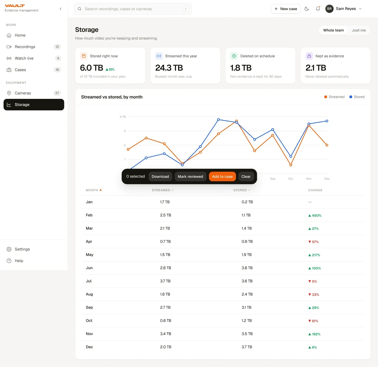
The reporting surface closed the loop for the organisation: storage and bandwidth trends became something an administrator could see and plan against rather than discover at procurement time.
Reflection
The recurring move across almost every decision here was the same: not make this step nicer, but does this step need to happen at this moment at all — and can it happen earlier, automatically, or not at all. That question is harder to ask on an enterprise product already in flight, and it was worth asking every time.
What I would carry into the next mission-critical system is the discipline of writing the principles down before the pressure arrives. The decisions that held up over two years were the ones I could trace back to a rule I had already committed to; the ones I had to defend from scratch every time were the ones I had never articulated.
The other thing I would carry is a lower tolerance for designing an average user. This product had judiciary users and cleaning-service operators reading the same screen, and every time I tried to serve the midpoint between them I served neither. Naming the two postures explicitly, and letting them diverge, was the decision that made the rest of the system possible.