A 0→1 vector tool, shipped in 10 days
Figma x Coding • AI-Native · Personal Venture
Role
Founder & Designer
Timeline
June 2026 — 10 days, concept to release
Team
Solo — product strategy, UX, interaction design, AI-assisted build
Skills
0→1 Product Design, AI-Assisted Development, Interaction Design, Scoping
Overview
Dotlet is a browser-based vector tool. You place dots on a grid, they merge into smooth organic shapes in real time, and you export a clean SVG or PNG. No pen tool, no anchor points, no prior experience.
The gooey filter engine is the whole product: an SVG feGaussianBlur and feColorMatrix pipeline running live in the browser, turning separate dots into one organic shape as you draw, with no rasterisation until export. The skill the tool asks for is placement, which everyone already has.
I built it solo in 10 days for Config Makeathon 2026, entirely inside Figma Make, and later used it as the live case study for a Friends of Figma workshop on AI-native design workflows.
The Problem
Most vector tools were built for people who already know how to design. Bezier curves, anchor points, node editing — weeks of skill before you can make something that looks intentional. That curve quietly keeps out people who aren't missing creativity, only the tool that meets them where they are.
- –Students building a first portfolio with no design background and no budget for a designer.
- –Small business owners who need a simple mark but can't justify an agency for it.
- –Community organisers who want a symbol for a cause, with no time and no training.
- –Self-taught designers who have the visual sense but not yet a vector tool's interface.
Ideation and Concept Exploration
Figma AgentBefore any spec was written, the Figma design agent was used to explore what this tool could feel like.
Layout testing
Side panel vs floating controls were compared visually. The floating palette direction was chosen — the canvas stays clear, controls appear when needed.
Branding exploration
Name, colour, and identity were explored with the Figma agent. The sticker-sheet theme — blue #4A7FD4 on soft sky — came from a reference image.
Learning: Doing this before locking a requirements document meant the FRD was grounded in layout decisions that had already been visually tested — not made in the abstract.
IA + Features
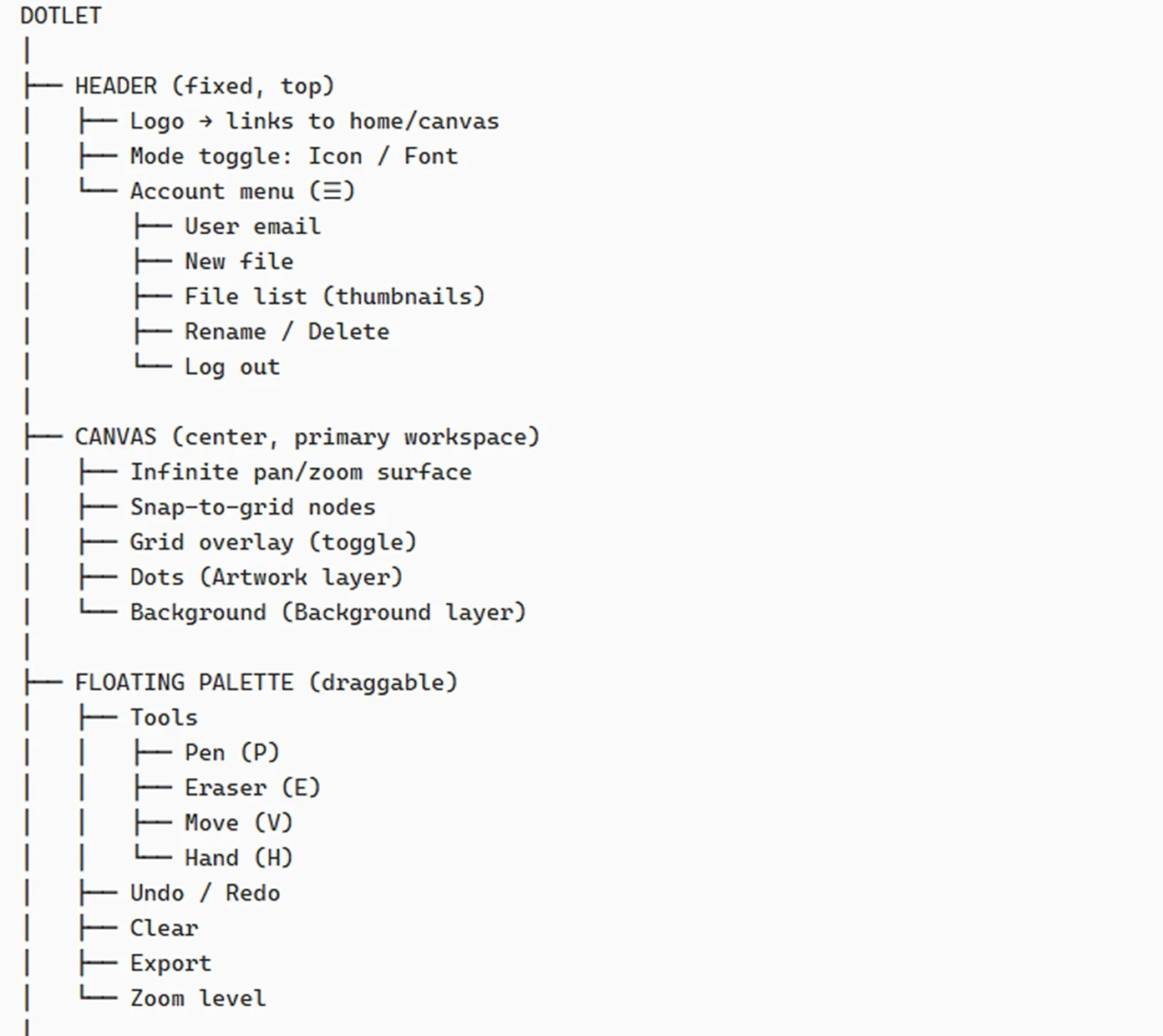
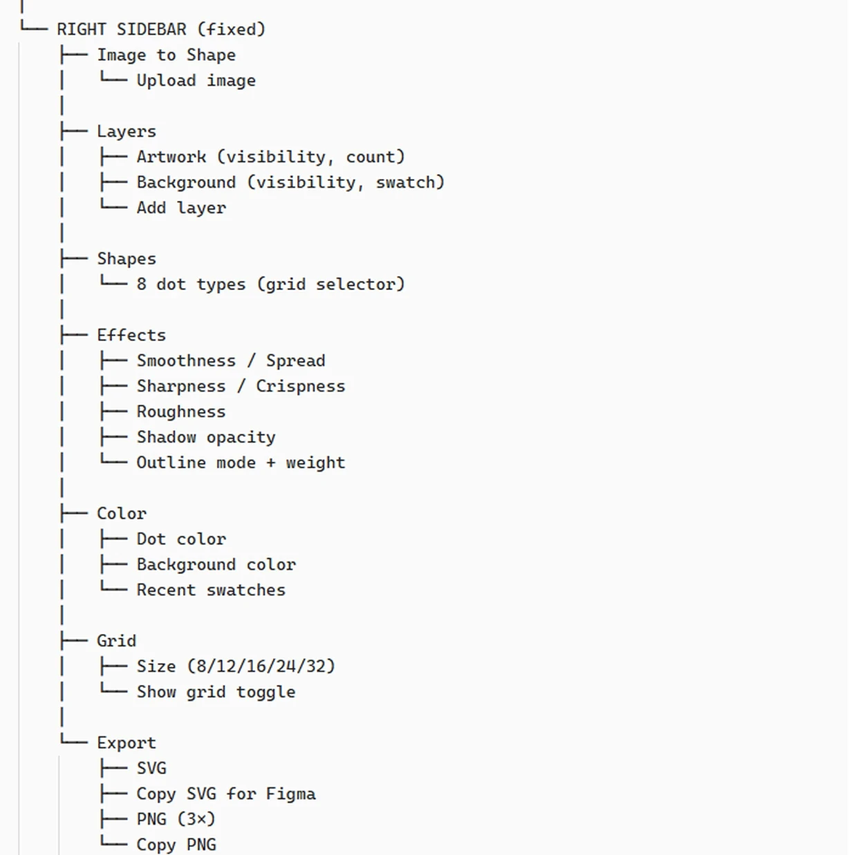
The whole tool is one screen: a fixed header, an infinite canvas, a draggable palette for the tools you reach for constantly, and a fixed right sidebar for everything you set once and adjust. Nothing is nested more than three levels deep, and there is no navigation to learn.
Core Flows
Shapes & colour
Shape and colour get chosen once and then left alone, which is why they sit in the sidebar rather than over the canvas. Recent colours are kept because most people are making a set, not a single icon, and the second one has to match the first.
Pen, eraser & move
Dots that land close enough join on their own. That is the whole trick — you decide where the marks go, and the joining is handled for you. Nothing here asks anyone to control a curve, which is the skill that keeps people out of vector tools in the first place.
Effects
Every one of these changes the finished look without touching the dots underneath, so anything can be tried and taken back. That mattered more than adding options: someone who is not sure they can undo a change will not risk making one.
Image to shape
Starting from a picture is easier than starting from nothing, and a blank canvas is where most people give up. What comes back is dots rather than the picture itself, so it stays yours to change — and the original never ends up buried in the file.
Tour guide
Shown once, skippable, and before any sign-up is asked for. Anyone made to create an account before they understand what a tool is for usually never finds out, so the walkthrough comes first and the first thing anyone does is draw.
Made in Dotlet
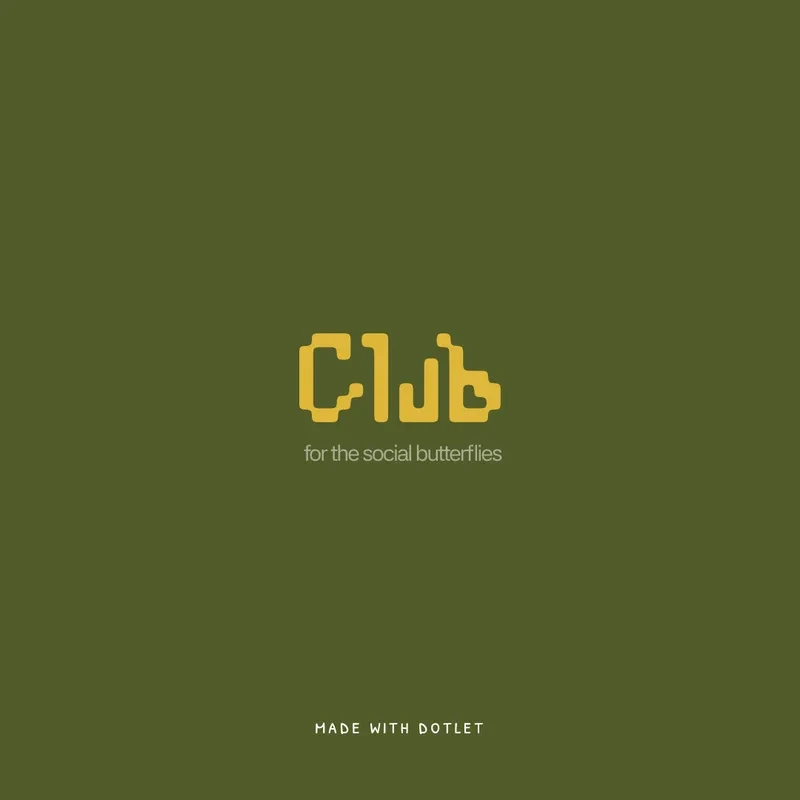
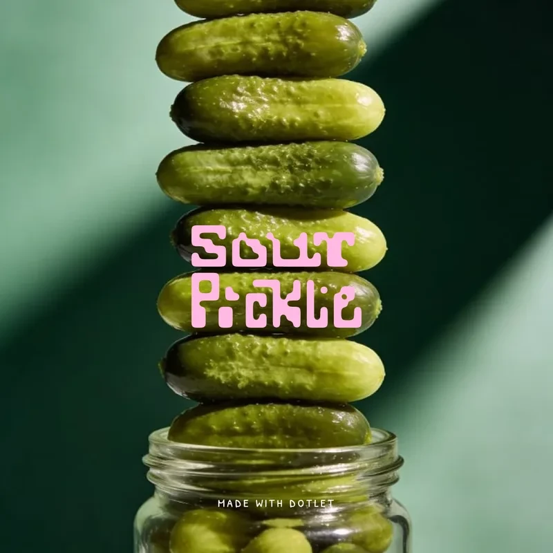
Everything below was drawn in the tool itself, with no other software involved at any point. They are here because a feature list only describes what a tool can do, and the marks are what it actually does.
None of them needed a curve to be adjusted by hand. The dots decide where the edges fall, so the person drawing is choosing placement rather than steering geometry — which is the whole reason someone with no vector training can finish one of these at all.
What people created with Dotlet
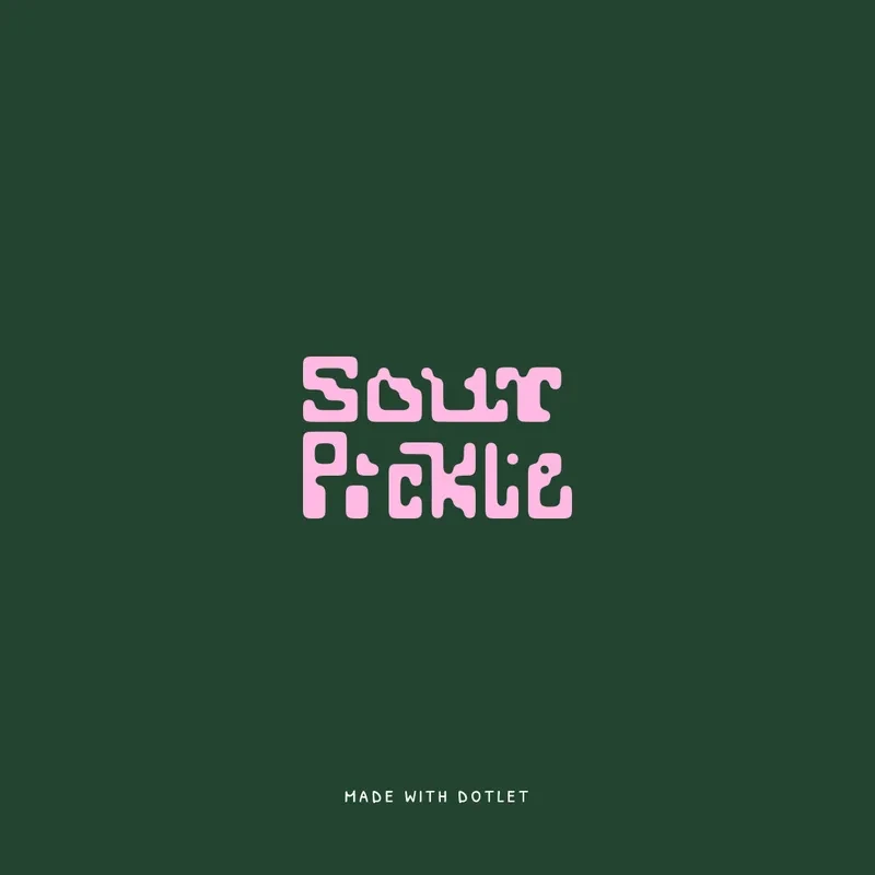
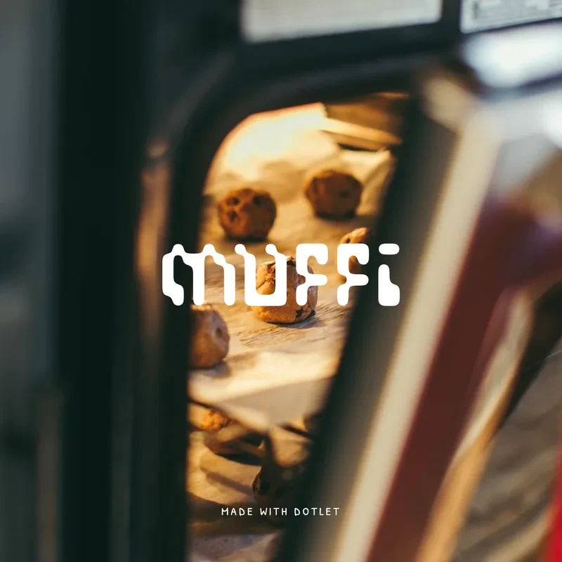
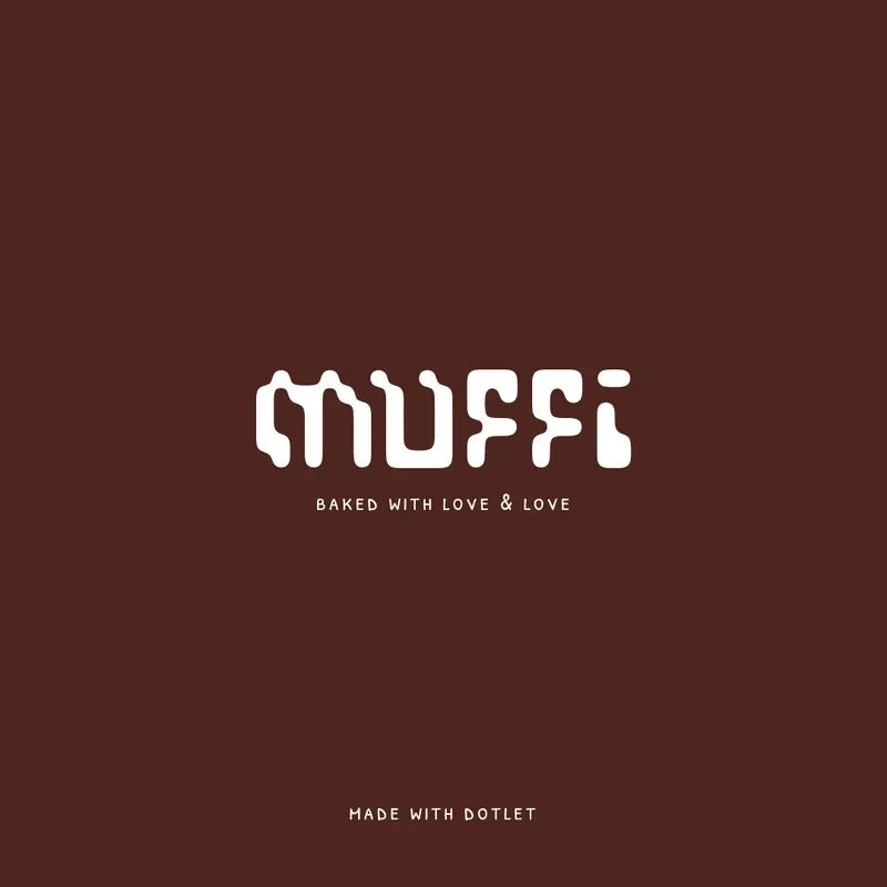
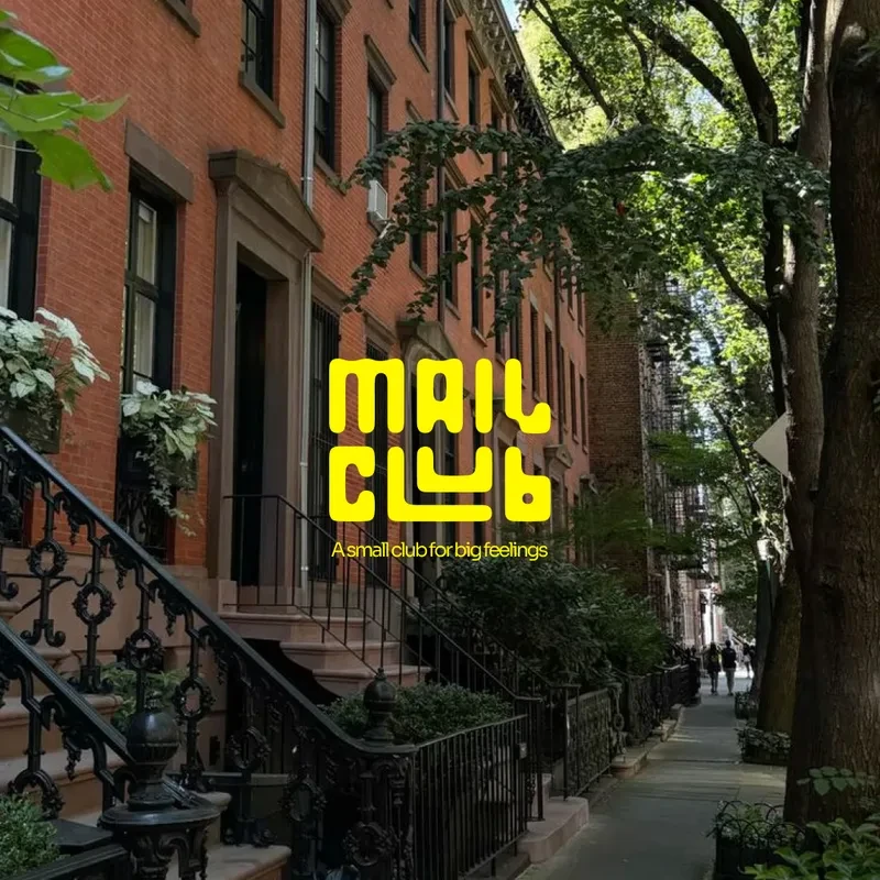
Four identities, each one a wordmark drawn on the grid and then put straight onto packaging, posters and social. Ideation to execution ran 50% faster than the same work done conventionally.

How It Did It
Writing a full Functional Requirements Document before opening Figma Make was the single decision that made everything else go more smoothly.
Why the FRD mattered
Most AI-assisted builds start with a vague prompt and iterate until something looks right. The FRD forced the opposite: define what the tool is, what it does, how it behaves, and what it will never do — before writing any code. Every Figma Make prompt that followed was specific because the spec was specific. The tool built what was actually meant, not what was accidentally implied.
What changed
The scope was widened deliberately: from “icon tool” to “icons, logos, custom shapes, symbols, and decorative marks — anything that would otherwise require a path editor.” The grid expanded from 3 presets to 5. The shape palette doubled from 4 types to 8. The entire vocabulary was replaced so that every term in the spec, the UI labels, and the code matched — no ambiguity between what the FRD said and what Figma Make built.
The out-of-scope list as product reasoning
Most specs list what to build. This one also listed what not to build — and crucially, why. Every exclusion was written with a reason tied to the product's core premise. That reasoning became the test for every new feature idea that came up during the build.
 Out of scope:Freeform path / bezier editingReintroduces the exact precision barrier the product exists to remove. If users need a pen tool, they already have a pen tool.
- Out of scope:AI-generated shape inputConflicts with a hands-on, skill-free creation model. The tool should respond to what the user places, not generate for them.
- Out of scope:Raster image importOutside the defined vector-first workflow. Dotlet creates from scratch — it doesn't convert or embed.
- Out of scope:Animation / motion exportDotlet is a static vector tool. Motion would require a second rendering pipeline with no connection to the gooey filter engine.
Governing principle: the product must not reintroduce a technical skill requirement at any stage of the workflow. This rule was written in the FRD before any code was written. It was used again when the Font Builder was evaluated — and it's why the Font Builder was eventually cut.
Tech stack — what was actually used and why
- Figma MakeThe entire app was built inside Figma Make — not scaffolded locally then imported. Every feature shipped as a structured, isolated prompt, from first line to final export.
- Figma AgentRan alongside Make for ideation — layout variations, design decisions, exploratory directions — without spending Make credits on non-code questions.
- React + TypeScriptThe default Make project base. Strict typing earned its place across the dot data model, cluster IDs, tool types, and history stack — it caught real bugs in the per-dot colour override added midway.
- Vite + Tailwind CSSVite's HMR made iterative canvas work practical: dot geometry, filter values, and export logic reflected instantly. Tailwind handled all UI layout and palette styling.
- Web Audio API — custom sound engineNo sound library — every sound is hand-built synthesis. Draw is pink noise through a bandpass tuned to graphite on paper; erase, a short sine squeak; save, a C5–E5–G5 arpeggio with a long decay. Mute persists via localStorage.
- SVG filters + Canvas APIThe gooey engine is pure SVG — feGaussianBlur and feColorMatrix applied live, with no canvas rasterisation while drawing. Canvas is used only at export, to rasterise into a high-resolution PNG.
Building It
Every feature was a scoped, isolated prompt rather than one large request. The first canvas was a fixed 1000×1000 viewBox; it worked but felt bounded, so it was rewritten around a fixed logical cell with infinite pan and zoom, zoom-toward-cursor, and no bounds check at all.
The detail I'd defend hardest is the sound. Every effect is synthesised from scratch with the Web Audio API — the draw sound is pink noise through a bandpass filter, sitting where graphite on paper sits; the eraser is a short sine squeak; saving is a three-note arpeggio with a long decay. It was too loud on the first pass, and the mute preference persists between visits.
What Broke
The export pipeline was the most error-prone part of the build, and every failure was the same failure wearing a different mask: code that worked in the live canvas making different assumptions once it ran in the export context.
Exports came out empty because dimensions were locked to a fixed square while the canvas panned infinitely. The output canvas sized itself to 0×0 because SVG blob URLs report a naturalWidth of zero. The gooey effect appeared in PNG but vanished in SVG because browsers default standalone files to linearRGB, so the colour matrix fired at the wrong level.
- –The fix was structural, not incremental: stop duplicating logic and make export reuse the same source of truth as the canvas — one spread calculation, one crispness calculation, called from both paths.
- –An earlier bug was pure geometry. Shapes showed gaps at adjacent nodes because the dot radius was 0.36× the cell size, leaving a 28% gap. The filter was blurring empty space — there was nothing to merge.
Built, Then Removed
A Font Builder — marching-squares tracing into editable bezier paths, exporting a working .ttf — worked in principle but never reached a working state in the time available. Shipping it would have been dishonest about what Dotlet does, so it came out of the app and the documentation, and stayed only as a documented future direction.
An account system with Supabase went the same way, but for a better reason than the configuration problems that surfaced mid-build: requiring a login worked against the premise that anyone can open Dotlet and start creating with nothing in the way.
Reflection
Every stage that went well shared one property — the intent was made specific before the AI was asked to act on it. Every stage that went badly shared the opposite: something left vague, or something that worked in one context and was copied rather than shared into another.
Both cut features reflect the same instinct that shaped the product. Dotlet does one thing: it lets anyone make a vector graphic without knowing what a bezier curve is. That part works, and it was worth more than the two features that would have diluted it.